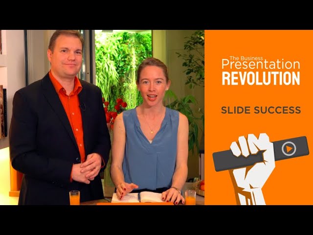
Powerful visuals come from powerful messages and clear visual ideas. But sometimes slides aren’t necessary. The days of ‘Death by PowerPoint®’ are over. Take 5 to discover the 3 simple steps to slide success that will help you achieve your objectives—and leave your audience wanting more—in our new episode of The Business Presentation Revolution podcast, with presentation experts Rose Bloomfield and Phil Waknell.

Transcript
Rose: [00:00:00] Welcome to The Business Presentation Revolution: your colorful cocktail of presentation goodness.
Phil: [00:00:06] Today we’re focusing on slides. Why most slides fail and three steps to make sure yours succeed.
Rose: [00:00:16] So today people really don’t like PowerPoint and there’s good reason for that. In fact, maybe we should just stop using it?
Phil: [00:00:24] Well we could and in fact a lot of presentations would work very well without any visual aids. And it’s much better for a presentation to have no slides than to have bad slides. But if people hate PowerPoint and the other slide technologies it’s not because of the technologies themselves. It’s because of the way they are used. And if you think that a good slide is just a whole bunch of bullet points behind you, well you can understand your audience not liking that. So, I think you shouldn’t “throw out the baby with the bathwater”. It’s not the tool, it’s the fool who doesn’t know how to use it that’s the problem.
Rose: [00:01:01] Great. So Phil, you promised us three techniques for slide success. What’s the first one?
Phil: [00:01:08] So the first one is to always remember that you’ve got to make sure you know what you’re going to say before you start to think about your slides. The slides should illustrate what you’re saying. You are not there to comment on the slides that are behind you.
Rose: [00:01:25] OK. So first step: speech before slides. What’s the second step?
Phil: [00:01:30] Well the second step is not to get your computer involved too early. In fact what you really need to do is to switch off your computer when you start thinking about the slides. You first think about the story, we’ve already done that. But then you think, “how do I want to illustrate that?” And you do it analog. You do it with some sticky notes or with a whiteboard or whatever, but then you can imagine what you would want to have as a visual aid to help your audience. And only then can you start designing it in your slide application of choice.
Rose: [00:02:04] Perfect. Okay, step one: speech before slides. Step two: analog storyboard first. In fact, at Ideas on Stage, the presentation directors or coaches tend to create a storyboard first, based on the key messages of our speakers, and then we deliver it to the designer. The designer is the one that makes it beautiful in PowerPoint only once we have a clear idea of where we’re going visually. So we have the first and second step. Phil, what’s our third step?
Phil: [00:02:33] Well the third step, Rose, is absolutely to remember that slides are not documents. So yesterday I was giving a class for a business school and one of the people in the audience said that she really hates it when people confuse slides and documents. When they confuse PowerPoint with Word. And this is a problem. We often produce really bad slides because we think we can kill two birds with one stone. Like the slide that is going to be on the wall behind us while we’re speaking is also a document that we can distribute before or during or after the presentation. And you know what? Slides don’t make good documents and documents don’t make good slides. The more text you put up there in an attempt to make it useful for someone reading afterwards, well you know what’s going to happen? The audience will try to read; and human beings cannot read and listen at the same time. Right?
Rose: [00:03:31] Absolutely.
Phil: [00:03:32] Not even ladies can do that Rose, can they?
Rose: [00:03:34] No, I know we’re great multitaskers, but it’s pretty hard to do both at the same time. So we have three successful steps for designing effective slides. One: speech before the slides. Two: analog storyboard first. Three: don’t confuse your slides with a document. So separate those two.
Phil: [00:03:57] So once we’ve understood that your slides are only visual aids during our presentation and that we don’t need to distribute them because we have documents, well then we can design them effectively. But that is for another show.
Rose: [00:04:10] So thank you for joining The Business Presentation Revolution. We have a lot more to share with you about delivery and slides. So if you’d like to receive more subscribe to our YouTube channel or anywhere else you get your podcasts and we look forward to seeing you next time!